Client
Services
- Branding
- Design
Rebranding Allerstorfer Elektroanlagen GmbH
Allerstorfer Elektroanlagen GmbH, a leading electrical services provider, approached our design agency with the objective of rebranding their company image to better align with their commitment to exceptional customer service and cutting-edge solutions. Our goal was to create a modern and captivating brand identity that would resonate with their target audience and position Allerstorfer as a market leader in the industry. This portfolio entry showcases the successful execution of the brand redesign project.
Design Concept
To achieve a modern and visually appealing brand identity, we focused on clean lines, a vibrant color palette, and engaging imagery that would captivate both existing and potential customers. The redesign aimed to create a sense of trust, reliability, and innovation associated with the Allerstorfer brand.
Logo Redesign
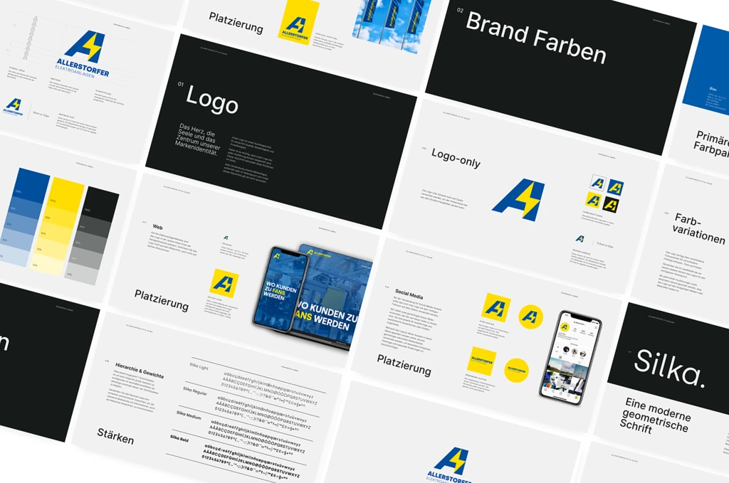
The previous logo, which was outdated and lacked visual impact, was completely overhauled. The new logo design incorporated a contemporary font with a dynamic and bold lettering style. The company name, "Allerstorfer Elektroanlagen GmbH," was simplified and presented in a clear and legible manner. The integration of a subtle electrical bolt icon within the logo added a touch of symbolism, representing energy and power while still maintaining a modern aesthetic.
Color Palette
To convey a sense of energy, professionalism, and modernity, we opted for a vibrant color palette. The primary color, a striking electric blue, was chosen to symbolize the cutting-edge technological solutions provided by Allerstorfer. This was complemented by a secondary color palette consisting of shades of gray and yellow, which added balance and sophistication to the overall design.
Typography
The typography selection played a crucial role in modernizing the brand. We chose a contemporary sans-serif font for the logo and headings, enhancing legibility and reinforcing the brand's commitment to simplicity and clarity. In contrast, a complementary serif font was used for body text, adding a touch of elegance to marketing materials and communications.
Slogan
The slogan "Wo Kunden zu Fans werden" (Where Customers Become Fans) encapsulates Allerstorfer's dedication to customer satisfaction and fostering long-term relationships. It speaks to their commitment to not only meeting but exceeding customer expectations, transforming ordinary clients into enthusiastic brand advocates. The slogan was carefully integrated into various brand assets, including advertisements, social media graphics, and the website, to consistently reinforce this message.
Marketing Collateral
We developed a range of marketing collateral, including business cards, letterheads, brochures, and digital assets, ensuring a consistent visual language across all touchpoints. These materials featured a clean and modern design, combining the brand's refreshed logo, engaging imagery, and strategic placement of the slogan. The collaterals were designed to make a lasting impression and enhance the overall brand experience for Allerstorfer's customers.
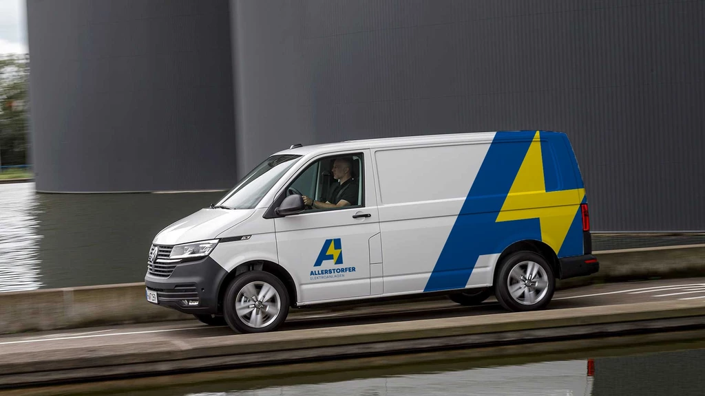
Car branding
In addition to the core brand redesign, we also explored creative opportunities to enhance Allerstorfer's brand visibility and recognition. One of the key elements we introduced was the use of car stickers. These custom-designed stickers featured the refreshed logo, vibrant colors, and the memorable slogan "Wo Kunden zu Fans werden." By strategically placing these eye-catching stickers on the company's fleet of vehicles, we transformed them into moving billboards, effectively reaching a wider audience and increasing brand exposure. The car stickers not only added a touch of modernity and professionalism to the vehicles but also acted as a conversation starter, sparking curiosity and generating buzz about Allerstorfer's services. This innovative approach to brand promotion further solidified Allerstorfer's presence in the market and reinforced their commitment to exceptional customer service.

Results
The brand redesign project for Allerstorfer Elektroanlagen GmbH has successfully transformed the company's image into a modern and customer-centric brand. The new visual identity effectively communicates Allerstorfer's commitment to providing cutting-edge solutions and exceptional customer service. Since the launch of the rebranded materials, Allerstorfer has experienced increased brand recognition, customer engagement, and a significant boost in new business inquiries.
Conclusion
Through a meticulous process of strategic design thinking, we successfully executed the brand redesign for Allerstorfer Elektroanlagen GmbH, focusing on a modern design approach. The revitalized logo, vibrant color palette, carefully selected typography, and strategic incorporation of the slogan "Wo Kunden zu Fans werden" have contributed to Allerstorfer's transformation into a dynamic and customer-centric brand. The new brand identity has resonated with their target audience, creating a strong emotional connection and fostering customer loyalty.
By embracing modern design principles, Allerstorfer Elektroanlagen GmbH now stands out among its competitors as a leader in the industry. The brand's refreshed image has not only attracted new customers but has also solidified relationships with existing ones, turning them into passionate brand advocates.
The successful execution of this brand redesign project has not only elevated Allerstorfer's market position but has also set the foundation for future growth and expansion. The modern design elements, combined with the powerful slogan, have created a strong and memorable brand presence that will continue to resonate with customers for years to come.
Overall, our collaboration with Allerstorfer Elektroanlagen GmbH on this brand redesign project has been a rewarding experience. We are proud to have contributed to their journey of becoming a customer-focused brand where customers truly become fans.

Additional Latest works
Association Montessori Internationale
Our agency partnered with the Association Montessori Internationale (AMI), a renowned non-governmental organization (NGO), to revamp their digital presence and enhance the user experience on their website.
Year of the Dog: Poster Design for Chinese New Year Children Concert
Understanding the significance of the Chinese New Year celebrations, we embarked on a creative journey to design a visually striking poster.


