Client
Services
- Branding
- Design
Re-Branding Glatztechnik GmbH
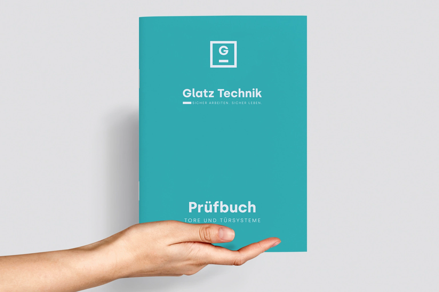
Glatztechnik GmbH, a prominent player in the competitive market of technical inspections, partnered with our design agency to embark on a comprehensive rebranding journey. The project's primary objectives were to modernize the company's image and attract new talent in a competitive market. Our goal was to create a visually captivating brand identity that would resonate with the target audience and serve as an appealing proposition for potential employees. This portfolio entry showcases the successful execution of the rebranding project, emphasizing the modernization of Glatztechnik GmbH and positioning them as an attractive employer through the strategic use of the teal and orange color palette.
Design Concept
The design concept for Glatztechnik GmbH's rebranding revolved around infusing the brand with a contemporary and energetic vibe. We aimed to create a visually striking brand identity that would capture attention, communicate innovation, and align with the company's forward-thinking approach. The teal and orange color palette played a vital role in achieving these objectives, conveying a sense of professionalism, dynamism, and creativity.
Brand Identity
The previous brand identity underwent a complete transformation to reflect a modern and vibrant look and feel. The new logo design incorporated sleek lines, bold typography, and a harmonious blend of teal and orange. The logo represents Glatztechnik's technical expertise, while the chosen colors added depth, evoking feelings of trust, innovation, and enthusiasm.
Color Palette
The teal and orange color palette was chosen deliberately to convey a contemporary and energetic brand image. Teal symbolized stability, trust, and sophistication, while orange added a burst of energy, creativity, and warmth. The combination of these colors resulted in a visually captivating brand identity that stood out from competitors and appealed to both customers and prospective employees.
Website Redesign
A key aspect of the rebranding project was the redesign of Glatztechnik GmbH's website. The website was transformed into a modern, intuitive, and user-friendly platform that showcased the company's capabilities, projects, and expertise. The teal and orange color scheme was thoughtfully integrated into the website design, creating a cohesive and visually engaging user experience. The vibrant colors, along with captivating imagery and clear messaging, effectively conveyed the company's modernity, professionalism, and commitment to innovation.
The claim
The claim "Let's Work Safe. Let's Play Safe. Let's Think Safe." embodies the core values and commitment of Glatztechnik. It reflects their unwavering dedication to ensuring safety in both work environments and recreational areas.
Employer Branding
To attract top talent in the competitive market, we developed a strong employer branding strategy for Glatztechnik GmbH. This included crafting a compelling employee value proposition (EVP) that highlighted the company's unique work environment, growth opportunities, and employee benefits. The teal and orange color palette was consistently applied across various recruitment materials, career-related content, and social media platforms, creating a cohesive and visually appealing employer brand presence.
Work clothing
The design of work clothes for all employees at Glatztechnik goes beyond aesthetics and functionality. Sustainability and ethical sourcing are integral considerations in the selection of materials and suppliers. Glatztechnik is committed to minimizing its environmental impact and promoting responsible practices throughout the supply chain.
The work clothes are crafted from sustainable materials, such as organic cotton or recycled fibers, reducing the ecological footprint associated with their production. These materials are carefully sourced from suppliers that adhere to stringent ethical and environmental standards, ensuring fair labor practices and responsible manufacturing processes.
By integrating sustainability and ethical sourcing into the design of work clothes, Glatztechnik demonstrates its commitment to corporate social responsibility. Employees can wear their uniforms with pride, knowing that their clothing has been responsibly sourced, contributing to a more sustainable and ethical future.
This approach not only aligns with Glatztechnik's values but also resonates with employees, who value sustainability and ethical practices. It fosters a positive company culture that encourages environmental consciousness and social responsibility, creating a sense of unity and purpose among the workforce.
Furthermore, the incorporation of sustainable and ethically sourced materials in work clothes sets an example for clients, suppliers, and the industry as a whole. Glatztechnik strives to inspire others to adopt sustainable practices, contributing to a more environmentally friendly and socially conscious construction management sector.
The design of work clothes at Glatztechnik reflects a holistic approach, where aesthetics, functionality, and sustainability converge. By embracing sustainability and ethical sourcing, Glatztechnik not only ensures the well-being of its employees but also sets a precedent for responsible practices in the industry, reinforcing the company's commitment to a more sustainable and ethical future.
Results
The rebranding project for Glatztechnik GmbH achieved its objectives of modernization and talent attraction. The dynamic and contemporary brand identity, infused with the teal and orange color palette, effectively positioned Glatztechnik as an innovative and appealing company in the market. The redesigned website showcased the company's expertise and attracted both clients and prospective employees, while the strategic employer branding initiatives resulted in increased interest from top talent.
Conclusion
Through meticulous execution, the rebranding project successfully modernized Glatztechnik GmbH's brand identity and positioned them as an attractive employer in the competitive market. The vibrant teal and orange color palette brought energy, creativity, and professionalism to the brand, capturing attention and communicating the company's modernity and innovation. The redesigned website, along with the employer branding efforts, served as powerful tools in attracting new clients and top talent. The cohesive and visually captivating brand identity, infused with the teal and orange color palette, effectively communicated Glatztechnik's forward-thinking approach, professionalism, and commitment to excellence.
Since the launch of the rebranding initiative, Glatztechnik GmbH has experienced increased brand recognition, engagement, and interest from prospective clients and employees. The modernized image and appealing employer brand have positioned the company as a desirable choice in the market, helping them to attract top-tier talent in the competitive industry.
Overall, our collaboration with Glatztechnik GmbH on this rebranding project has been a tremendous success. The infusion of the teal and orange color palette, alongside the modernized brand identity, has elevated the company's position and enhanced its appeal to both clients and potential employees. We take pride in contributing to Glatztechnik's journey toward a more vibrant, contemporary, and competitive presence in the technical engineering landscape.
Additional Latest works
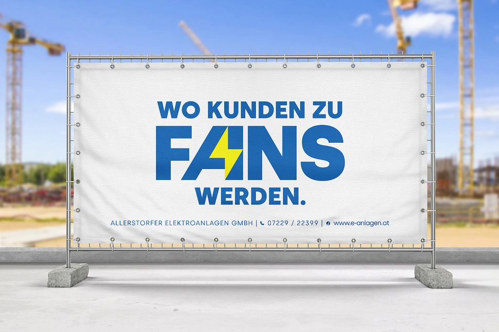
Rebranding Allerstorfer Elektroanlagen GmbH
Allerstorfer Elektroanlagen GmbH, a leading electrical services provider, approached our design agency with the objective of rebranding their company image to better align with their commitment to exceptional customer service and cutting-edge solutions.
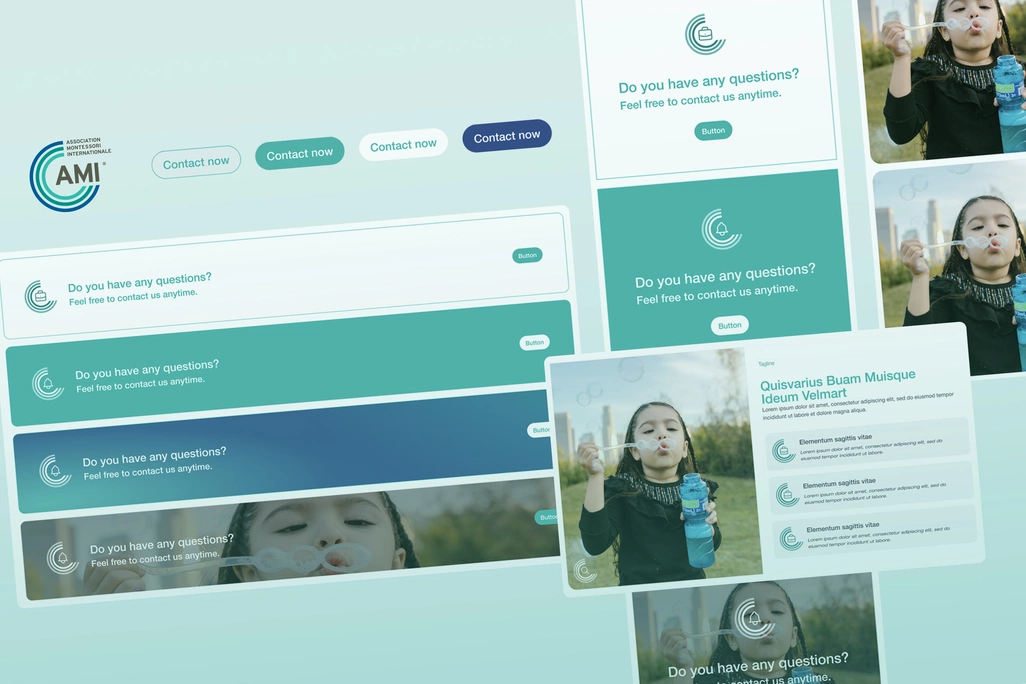
Association Montessori Internationale
Our agency partnered with the Association Montessori Internationale (AMI), a renowned non-governmental organization (NGO), to revamp their digital presence and enhance the user experience on their website.

