Client
Services
- Design
- Web-Development
Web Development Spirk & Partner
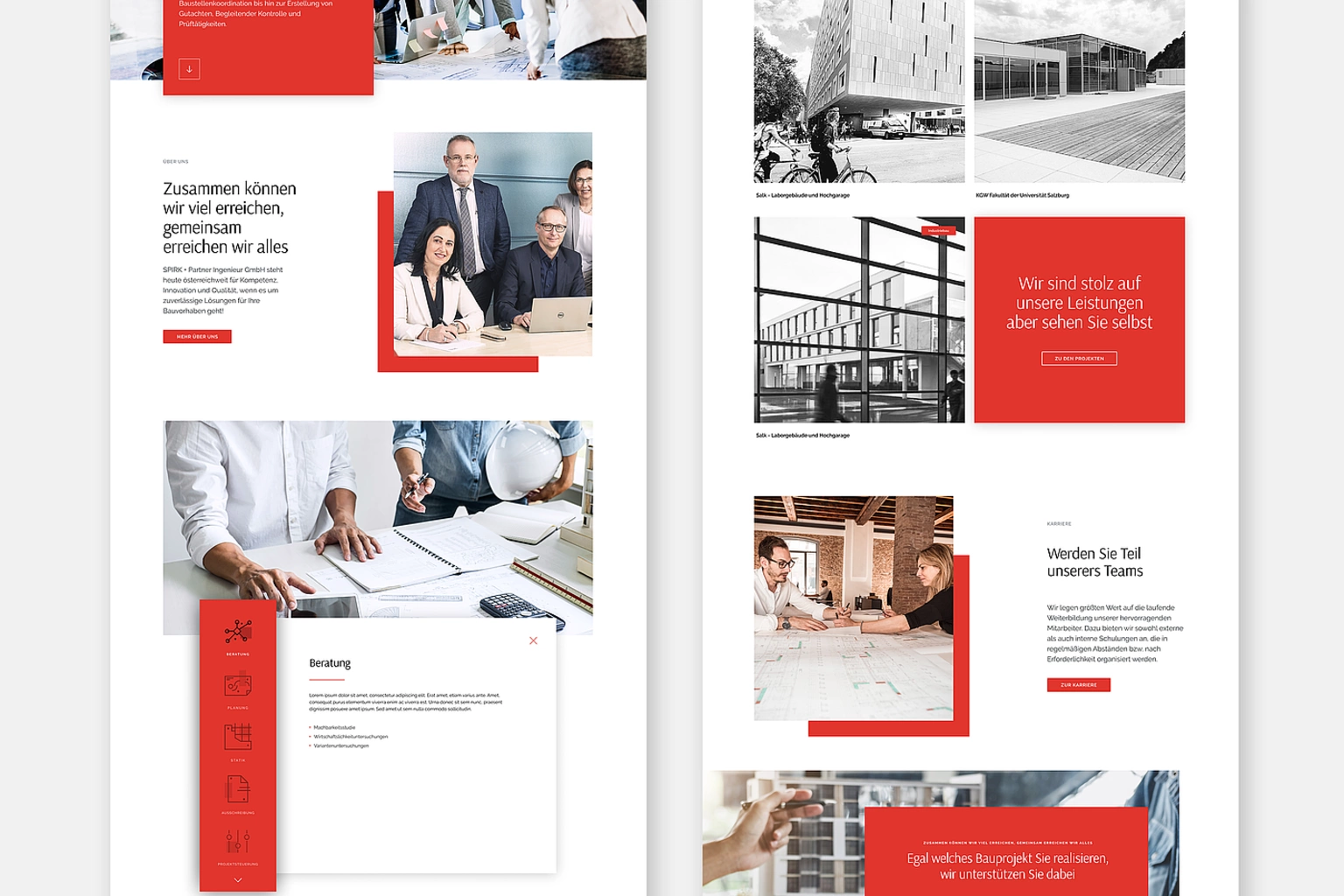
Spirk & Partner, a renowned construction management company in Austria, approached our design agency with the objective of revamping their website to better reflect their expertise, professionalism, and commitment to delivering exceptional construction solutions. Our goal was to create a visually striking and user-friendly website that would effectively showcase Spirk & Partner's extensive portfolio, highlight their industry leadership, and provide a seamless user experience. This portfolio entry showcases the successful execution of the website redesign project, incorporating the colors red, gray, and white to evoke a sense of confidence, sophistication, and reliability.
Design Concept
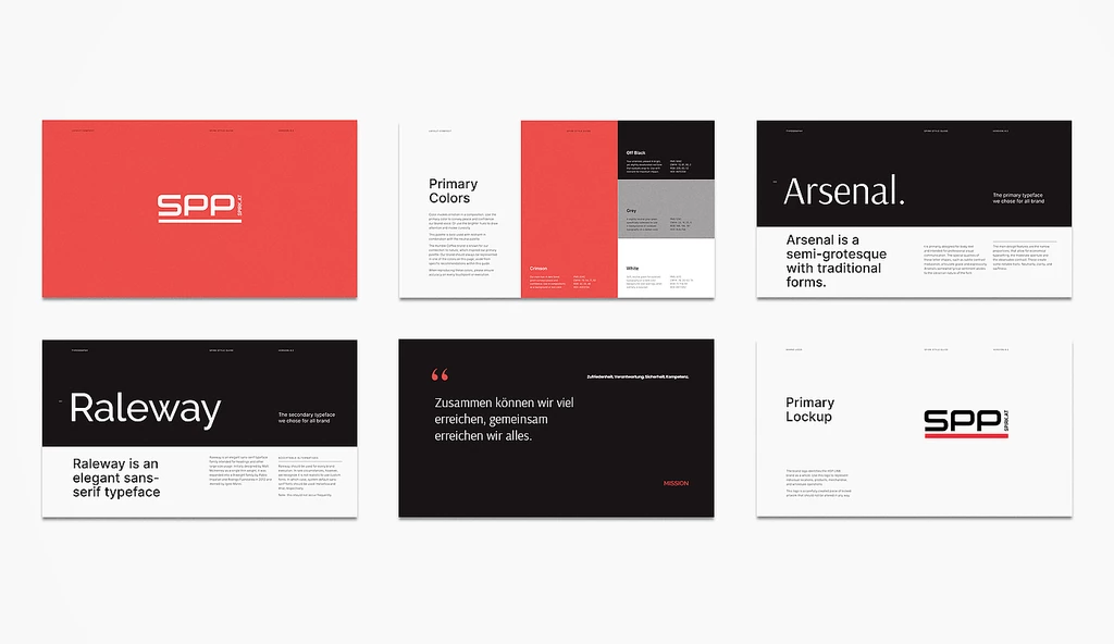
The design concept for Spirk & Partner's website redesign revolved around a clean and modern aesthetic, focusing on the harmonious integration of the chosen color palette. The use of red, gray, and white played a vital role in conveying Spirk & Partner's brand identity, professionalism, and attention to detail.
Color Palette
The color palette was carefully selected to align with Spirk & Partner's brand image. The dominant color, red, symbolizes strength, energy, and passion, reflecting the company's commitment to excellence and drive for success. Shades of gray were incorporated to evoke a sense of professionalism, elegance, and reliability, while white was used to provide a clean and spacious backdrop, enhancing readability and visual appeal. The harmonious combination of these colors created a visually impactful and cohesive brand presence throughout the website.
Website Design and User Experience
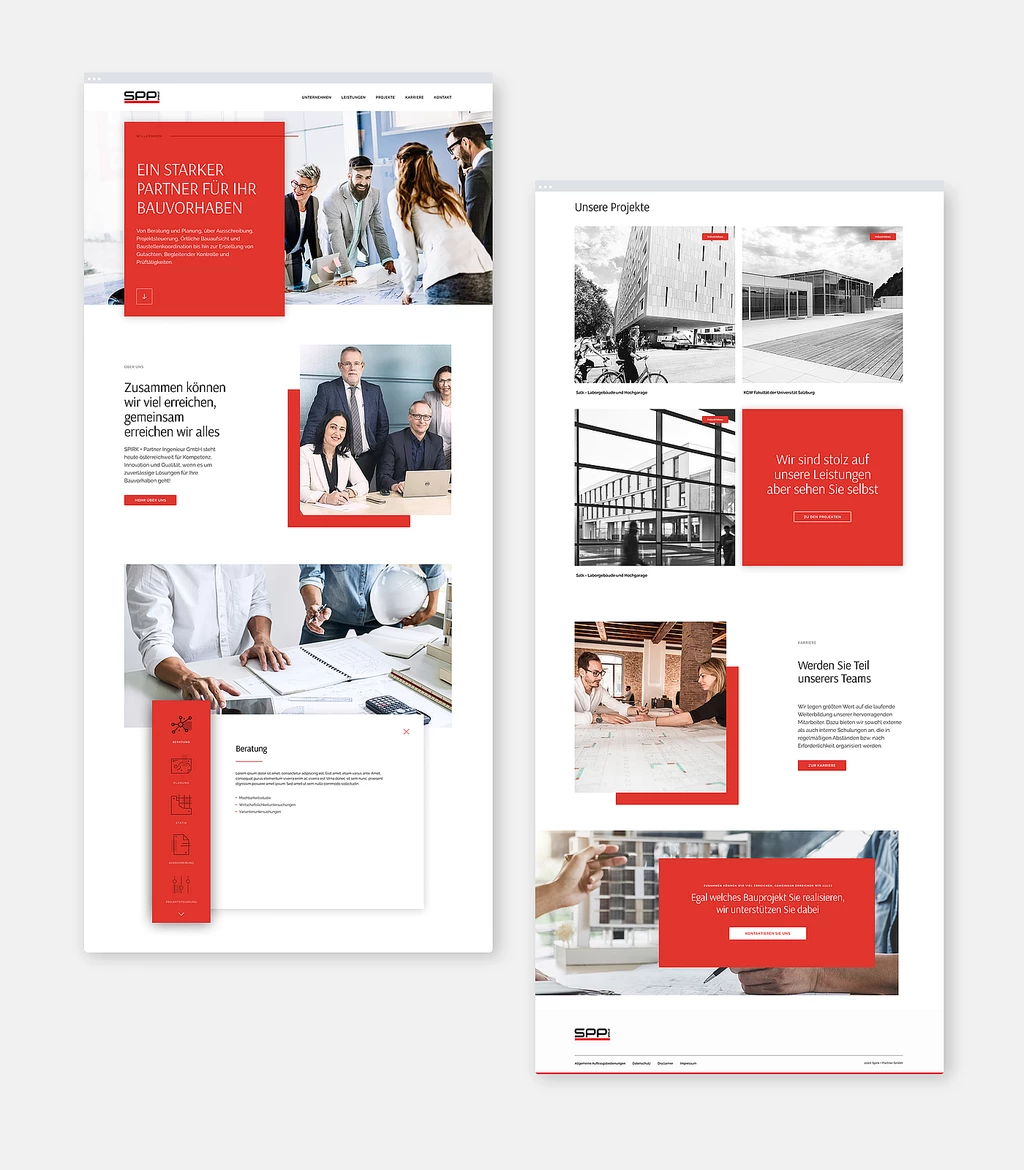
The website's design was focused on providing a seamless user experience and intuitive navigation. A modern, minimalist layout was adopted to emphasize content and showcase the company's portfolio, projects, and expertise. The homepage featured a bold red banner, creating an immediate visual impact and capturing visitors' attention. Clear and concise calls-to-action were strategically placed to guide users through the website and encourage engagement.
Typography
To complement the clean design and enhance readability, a combination of serif and sans-serif fonts was utilized. The use of a strong and contemporary sans-serif font for headings and titles projected a sense of professionalism, while a classic serif font was employed for body text, adding elegance and readability to the content.
Portfolio and Project Showcase
One of the key focuses of the website redesign was to highlight Spirk & Partner's extensive portfolio and showcase their past projects. A dedicated portfolio section was designed to present projects in an engaging and visually appealing manner, utilizing high-quality imagery, project details, and client testimonials. The portfolio section served as a testament to Spirk & Partner's expertise, industry leadership, and successful track record.
Responsive Design
Recognizing the importance of a mobile-friendly website, we ensured that the redesigned Spirk & Partner website was fully responsive across different devices and screen sizes. This allowed visitors to access and engage with the website seamlessly, regardless of their preferred device, providing an optimal user experience.
Results
The Spirk & Partner website redesign project successfully transformed their online presence, showcasing their expertise and professionalism in the construction management industry. The revitalized website, incorporating the red, gray, and white color palette, captivated visitors and effectively conveyed the company's commitment to excellence. The user-friendly interface, intuitive navigation, and visually appealing portfolio showcase led to increased engagement, longer visit durations, and improved lead generation. The redesigned website positioned Spirk & Partner as a trusted and reputable construction management company in Austria.
Conclusion
Through meticulous attention to detail, strategic use of colors, and a focus on user experience, our design agency successfully executed the website redesign project for Spirk & Partner. The redesigned website now serves as a powerful tool to attract and engage potential clients, while also reaffirming the company's position as a leader in the construction management industry. The harmonious integration of the red, gray, and white color palette throughout the website instills a sense of trust, reliability, and professionalism in visitors.
The revamped website's impactful design, coupled with intuitive navigation, allows users to effortlessly explore Spirk & Partner's diverse range of services, past projects, and expertise. The portfolio section showcases their exceptional work through stunning imagery, detailed project descriptions, and client testimonials, effectively demonstrating their ability to deliver successful construction solutions.
The mobile-responsive design ensures that the website adapts seamlessly to different devices, providing an optimal browsing experience for users on smartphones and tablets. This accessibility further expands Spirk & Partner's reach, allowing potential clients to engage with the company's offerings conveniently, regardless of their preferred device.
Since the launch of the redesigned website, Spirk & Partner has experienced a significant increase in website traffic, prolonged user engagement, and improved lead generation. The modern and professional aesthetic, coupled with the user-friendly interface, has elevated their online presence and enhanced their brand reputation.
Overall, the Spirk & Partner website redesign project has successfully positioned the company as a trusted and reputable construction management firm in Austria. The skillful integration of the red, gray, and white color scheme has created a visually appealing and cohesive brand identity, reflecting the company's dedication to excellence and setting them apart from competitors.
Our collaboration with Spirk & Partner on this project has been rewarding, and we are proud to have played a part in their digital transformation. The redesigned website not only serves as a powerful marketing tool but also reinforces Spirk & Partner's commitment to delivering top-quality construction management services to their clients.

Additional Latest works
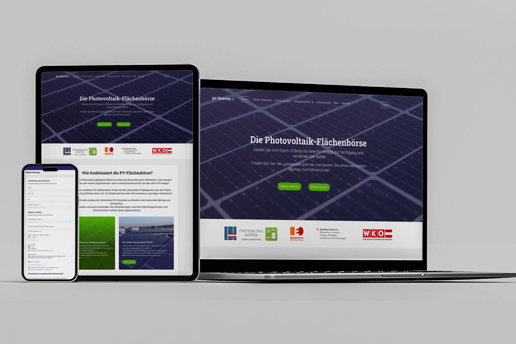
PV-Börse
The Energieinstitut, a pioneering organization in the renewable energy sector, entrusted our agency with the development of an innovative online platform.
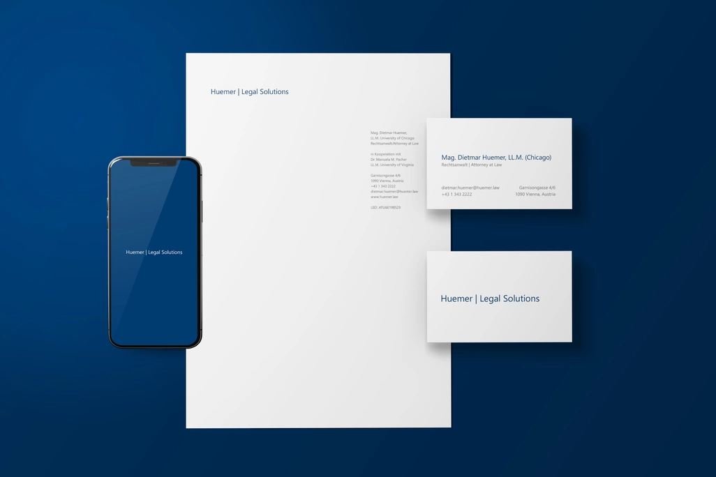
Branding for Huemer Legal Solutions
Our agency had the privilege of collaborating with Huemer Legal Solutions, a prestigious boutique law firm based in Vienna.


